Friday, November 28, 2014

The Sisters of the Brush have a holiday event...

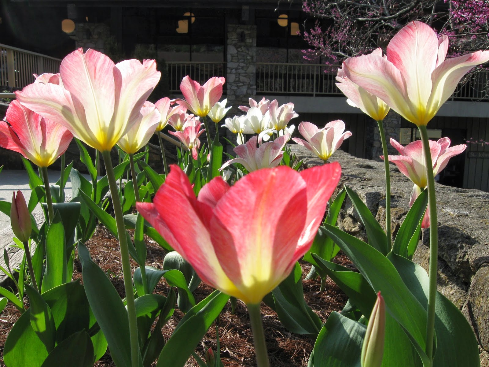
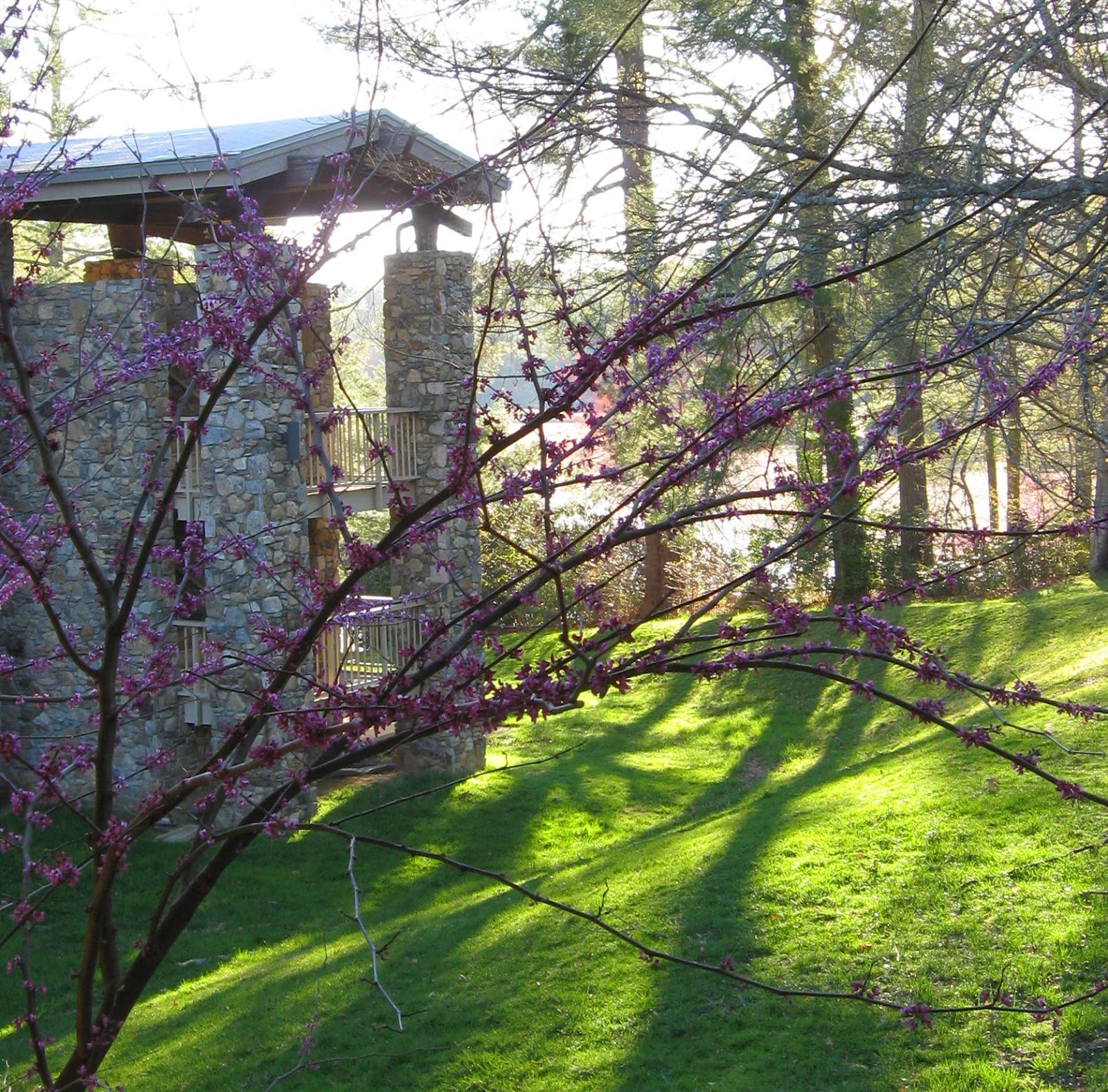
I probably haven't posted much recently about the SOBs with whom I associate.  They are aka the Sisters of the Brush, and we have critiqued and learned and painted and shown artwork together for quite a few years (don't make me go back right now to figure out the first time we met - but I'll guess well over 10 years).  This year we'd arranged to have our artwork featured at the Fieldstone Winery for the month of December.  Several of us have had solo shows there, and we've had a group display previously.  Because it's the holiday season, we've gotten ourselves into a mood for a party more than an opening.  We're bringing our most affordable art (sometimes some older things, sometimes reproductions, often smaller items) so that our friends and followers can find something they like to take home. We also pledged that 50% of our artwork sales from the party and the month-long display will be donated to support the Mary McCarthy Anderson Art Scholarship fund.  We hope we can pull together a substantial amount in order to sponsor more students in their pursuit of artistic expression.

Mostly, we hope we will see you there!  You can come by to see and buy the artwork any time through the month of December, but on Thursday the 11th, you'll find us there, and a rack of notecards, and a rack of REALLY affordable matted/unframed originals and reproductions. You'll also find wine tastings (Fieldstone wines, of course),  and good refreshments.  So, does that motivate you to find time between 6 and 9 that evening? I sure hope so.  And of course, I also hope that Old Man Winter cooperates.  Enough of the bad weather just when you plan something fun!

Monday, November 17, 2014

The "FALL" art season begins

Both these pieces, painted earlier this year, have been accepted into the Birmingham Society of Women Painters fall exhibit, juried by artist Joseph Sim.  The show is being hung at the Birmingham Unitarian Church (a very nice venue), with the opening reception being held on Thursday, November 20th, from 6 to 8 pm.

Congratulations to Lisa Richter, who won BEST OF SHOW for this exhibition!

Yes, it may be the fall art season, but we have winter here too.

Saturday, August 30, 2014

Summertime painting

Pleased to say that two of my three submissions to the Our Town 2015 show/sale were accepted (no, not the paintings shown here: I'll post them later on).  That's a welcome pat on the back near the end of summertime which, for me, is traditionally my time of LEAST painting.  And, you might notice, least posting.

To those blogging art friends who have kept it up  (both their art and posting), congratulations on both, and, although I've not taken time to post comments, I have been watching your successes - many of them!

I actually did do some summertime painting too, though, this year, some of it at our cottage, most at home on the rainy days.  I decided to make summer painting into a 'Hobby', and not challenge myself. The goal was to make it fun and easy. In pursuit of that I stretched quarter sheets, half the size I've been working on usually.  I found interesting source photos - just fairly unchallenging still-lifes - did drawings, picked a few,  transferred the drawings to the paper, and then just carried the results and a small pallette with me up north.  Rainy days there were frequent this summer, and with   less to do in bad weather than when at home,  I got my painting time.  Two of the finished results are shown (very casual photography).  Anyway I like 'em, and even more, I liked painting them.


Hope you've had that much fun with art this summer. If not,  just wait. Those other seasons that shall remain nameless are indeed approaching, and maybe you'll find more time to get inside and make art.

Monday, June 9, 2014

MWCS Members Award!

Although I've been a member of this organization for a number of years, I'm not exactly sure what "Members Award" exactly means . . . Except that I'm a member and . . . I got it!

Saturday was the big day - the Michigan Water Color Society's 67th Annual Exhibition - which included a critique by juror Paul Jackson in the morning, a convivial and well attended board luncheon at midday, a lecture by the juror in the afternoon, and finally the awards ceremony we had all (well, I had) been waiting for!

I'm very honored by being chosen for one of the awards: the company of the thirteen award winning artists is of the highest caliber.  If you don't believe me, write to me to buy one of  our beautiful catalogs!! (Sorry: fund raising never ends. But the catalogs really are lovely
- and only $15).

Anyway, my husband reminded me to get a picture taken with the award winning painting  ("Treepodia"), so here it is for your perusal!

Monday, June 2, 2014

MWCS 67th Annual at Greater Flint Arts Council

 That's my painting (MINE!) in the upper left of the postcard and the poster for this event.  I actually had two paintings accepted into the show, a first for me, and have been feeling guilty and apologizing ever since (the large number of double-selections means that a lot of friends who submitted  amazingly wonderful paintings WEREN'T included - not ideal).

I was part of the little "committee" doing intake in Flint on Saturday, making sure all 70 paintings got there, had boxes, had wires, had white mats, had return shipping labels if need be. A wild and crazy 4 hours indeed, and not enough time to look closely at the incredible artwork.  THAT will be this coming Saturday. Hope to see you there!

For directions to GFAC, follow this link.


Sunday, May 4, 2014

A nice Opening Reception

I love this picture friend Janice took on Friday at the Lawrence St Gallery reception for the Sisters of the Brush exhibit.   That's husband Michael hiding behind me.  Next to my left ear is a painting by fellow SOB Barbara Markham. Behind the word "of" is one of my paintings.  Laura Host did a wonderful job hanging the show and we were very happy with it.

We had five of the seven 'Sisters' at the opening reception.  Although we won't all manage to be at the mid-month reception either, we hope to have a different mix.  And we hope you'll be able to attend. That reception is on Friday, May 16th, from 6 - 9 pm.

I also took a couple of short videos showing the complete show. IF I can figure out how to suppress the inane comments I was making from behind the camera, then I'll try to figure out how to post it.


Tuesday, April 29, 2014

Sisters of the Brush at Lawrence St Gallery

The final week before our exhibit at Lawrence St Gallery. The image at left is just a detail of one of the paintings I've chosen to show there. I still have to give it a title, though. I've rejected "Tiger in the Sun", it's initial name.  I want the title to somehow refer to or invoke the intensity of midsummer sunshine (yes, we DO have that now and then, even here in Michigan).  I'll need to have something thought up by tomorrow, I think.

The seven Sisters of the Brush descended on the gallery in waves on Saturday and Sunday, bringing our favorites, looking forward to seeing how Laura Host would hang them on the pristine white walls.  As a group we've been known to bring way too many pieces, and too large, so this year we made a special effort to cut back so the display wouldn't look cluttered and art-fair-like.  Well, we did TOO good a job: Laura called me later in the day on Sunday, saying, everything was hung, but that we were "short 6 or 7 paintings".  I first thought she meant they were MISSING!  No, she actually had some awkwardly empty wall sections. 

So the Sisters put their  heads together (digitally) and figured each of us could find one more painting to be included.  A flurry of drop-offs and pick-ups and transfers, and the additional paintings were delivered and hung on Monday.  It looks wonderful.

Anyway,  Lawrence St Gallery will be holding two receptions.  We expect that a majority of the 7 of us will be at each one. I'll be at both. If you are in the area for either of the following dates it would be so nice to see you there!

The opening reception is this Friday, May 2nd, and runs from 6 - 9 pm

The mid-month reception is, startlingly, mid-month, on Friday, May 16th, again from 6 - 9 pm.

Tuesday, April 22, 2014

More color, more color!

Recently, one of the artist groups I belong to (Birmingham Society of Women Painters) held a group critique, asking a well known local artist to come critique our work.  Most members brought in one or more of their paintings, the original, framed or unframed. This group works in all manners of media, oil, pastel, collage, watercolor, you name it.  But what was consistent  and remarkable (we all remarked on it!)  on this particular day was that everyone had just been through the same long Michigan winter.  I never saw so many colorful paintings. 
And here is my contribution to that trend. They were all stacked ready to go to the photographer, when I started looking at them (they needed some kind of title penciled on, so he knows how to name the files).  I guess I needed color, too  -   these are January, February, March, and a bit of April. FYI, the two in the center are from Kanuga.

Friday, April 18, 2014

Michigan Water Color Society Annual - Accepted!

Treepodia
I learned this week that both of my submissions were juried into the Michigan Water Color Society's upcoming annual exhibition.  How exciting is that?  I'm feeling a wee bit personally perplexed, though, because they are from the series of  mostly abstracts that I was working on all last summer and fall after my Kanuga workshop with Mike Bailey. I submitted them because I thought they were good enough, and I like them both, but since then have happily turned back from the abstracts to my floral/pattern paintings.  Now, the nod I have gotten for my abstract work seems to tell me, paint more of THOSE.  But . . . I'm not sure I really want to anymore.  So: what do I do with THAT?

Monday, April 14, 2014

Pushing the Pattern

My last post showed this painting, still unfinished as we left Kanuga.  I'm pretty sure if I had been there even one more day, Robbie Laird would have found time to reinforce a hint that I think I inferred earlier in the week - about remembering subtlety when indulging in my patterns.   Certainly a worthy goal, and one I often, but not always, should keep in mind.

In this case,  having brought the painting home and lived with it a while, it became clear to  me that  this one (like so many of mine) was about the pattern more than the flowers.  So I went with that. I've modified and pumped up and added pattern to the point where I hope it's obvious that the imbalance is intentional.

I am extremely pleased to have, from this year's workshop,  a COMPLETED PAINTING that's not a throwaway.  How rare is that?  And there are still those other starts, two of which show good possibility, plus a problem-child painting which will keep me challenged for quite a while as I try to solve the problems I created for myself as I started it.  

Tuesday, April 1, 2014

Here we are at . . . . Camp Kanuga!!!

Does that plant any tunes in your head?  Sorry (sort of). Anyway, it's wonderful here as usual. And the weather has blessed us with 70+ degrees the past two days and apparently for another couple of days.  The forsythia here have started to bloom, and there is a spectacular and enormous weeping cherry that gets better every day.   The picture below shows the little red schoolhouse where my "Mentor or Muse" class with Robbie Laird is being held. It's a nice long walk from the Inn, so I'm getting plenty of activity going back and forth.   Essentially the class is indeed independent study but with voluntary support and critique from Robbie.  Until now I've only known Robbie as the graceful and gracious director of Kanuga Watermedia Workshops, but indeed she is a very good teacher, mentor, muse.  I'm enjoying just the amount of support and independence that this workshop offers, and wondering how soon it will be offered again.
You can also see that, after just two days, I have a nearly finished painting that I like: this is very unusual for me, in that workshops are sort of known for pushing you in such new directions that you don't find your footing for a while. .. and certainly not soon enough to finish anything that you like.  So, I'm quite happy to have this one in the final stages, and a couple more well started, and still two days to paint.

What I don't understand is, why aren't ALL of you here too? In artists' heaven?  I wish you were!


Wednesday, March 26, 2014

But I don't have the Blues

It is very nice to have finished a painting, and, even better, one that I like,  just before leaving for Kanuga.   What a confidence builder!  A few weeks ago,   I took  a great number of source photos of this bouquet of white blossoms, in different blue glass vases and sitting on a variety of blue silk scarves.  This one didn't turn out the way I had planned or even what I expected (so, what else is new?).    But I like it anyway.

I'm all prepared for my "semi-independent study" with Robbie Laird at Kanuga (that's what I'm calling it, I'll report on what it actually is upon my return!).    Having chosen maybe a dozen source photos that I liked a lot, I spent the early part of March doing newsprint drawings from them.  That exercise helped me narrow down which ones held my interest.   I ended up with six favorite drawings.  I traced those drawings onto half-sheets of Arches 140, and THEN soaked and stretched the paper onto both sides of three pieces of Gatorboard.   This should give me lots to work on when I get there. 

I've never prepared so many "starts" at once before.  It has been fun and productive both.  I found my drawing skills coming back a bit as I worked.  I'm quite excited about what will come next, and pleased that I will have four days to work on all of these.    I am already wondering if it will turn into a new way of working for me.

Do most of  you have multiple paintings going at once? I'm usually sorry when I don't, because I am more likely to move too quickly and make poor decisions.  Setting things aside for a bit is never a bad idea.

Sunday, March 23, 2014

Get back to work!


This will just be a short post. You will see why:  Here I am, spending a nice Sunday afternoon, browsing the blogs of my new blog friends  (do you recognize this blog?).  But, I am being observed. See that little poster up there at the right? I circled it to make it more obvious. It was recently provided by an art friend.

Wait.

I'll make it easier for you to see.

And then I'll go.  Maybe you should too?


Friday, March 14, 2014

Mentor or Muse at Kanuga 2014


Kanuga 2011 - it was WARM that year!!!!
The Inn and Lake at Kanuga
I would dearly love to know how many of you are two weeks away from Kanuga, as I am.

Probably I need to insert a brief explanation of what I mean by Kanuga for those unfamiliar with it.  Kanuga Watermedia Workshops is art camp for adults!!!! ( Yay!)  Okay, a better description: a spiritual retreat facility in rural western North Carolina rents out its grounds for a week.  Ten or twelve well known watermedia instructors and maybe 200 artists show up on a Sunday for registration, and then for the next four days everything is about art and camaraderie.  Rooms in either a rustic inn or cabins in the woods, meals together at tables for eight in a big dining hall. Art class all day long, presentations and events in the evening.  And, after three years, even familiar faces.

I've signed up for Robbie Laird's (new) workshop that she's entitled, Mentor or Muse. I'm translating the detailed description to "SEMI-independent study" - at least, I think that's what I'll be getting.  I was initially very excited about this option, but of course as the day approaches, I'm semi-terrified (this is usual for me before a workshop).

The materials list is easy: there isn't one from Robbie, I just need to bring what I want to use.   I started a list for that weeks ago, so I'm feeling fine about that.  But, this time around I really need to know what I want to work on before I get there. So the preparation matters more than usual.

So far I've printed out a dozen or so possible source photos, and actually begun doing composition  drawings from each of them - this I hope will allow me to (1) quickly eliminate ones that are poor choices, and (2) take the 'finalists' and transfer the drawings to stretched w/c paper.  I know I'll need three or four to be working on, like I have at home on my most creative days: one to be thinking about, one to be drying, and one to actually be painting.  I'd like to take even more than that, just in case.  I'm resisting using any of these Kanuga "starts" ahead of time:  I want to keep my brush wet (to paraphrase Marilynn Derwenskus) between now and then, but also want to be excited and happy about what I'll have to work on when I get there. 

So: who should I be looking for when I get there? You, I hope.

Monday, March 10, 2014

Need advice on BLUE

My sweet big sister sent get well flowers (re broken ribs) last week, and they arrived in a cobalt blue vase, my favorite. Today, with a rare day of full sunshine, and a cessation of pain, I took the flowers that were still happy and started taking source photos in the sun room.  Loving the blue, I went hunting for background fabrics (I'm not a collector of such things like I know many of you are).  I found two shawls,  deep blue wool and  turquoise silk, and threw  them all together in the intense sunshine.

(Special note here: the flowers, the vase, AND the two shawls, I realized, were all gifts over the years  from this wonderful big sister! Am I a lucky 'baby' sister?)

So now I have 30+ source photos which, because they all have my favorite colors (and sunshine), are breathtaking to me.  I'd like to tackle at least ONE of them soon. But I've not painted blue very often or very successfully. So, I'm asking:

Looking at this source photo, typical of the ones I will choose from, do you have suggestions of the blues I should be using, and how to use them, to give them the life they deserve? (BTW - In stock I currently have  ultramarine, cobalt, cerulean, indigo,  and pthalo blues).

Friday, March 7, 2014

I don't love it but I like it

I'll go on record.  I don't regret at all that I obliterated the "real" desert sky color here.  I like it much better having taken the image somewhere else. I DO wish that I'd thought of it sooner, so that I could have done a more delicate red wash of a sunset sky - but because I was going over a cerulean and ultramarine wash, I had to get past that. So, it's pretty heavy looking. Surreal. Maybe that's why I like it.  It's certainly unexpected. I find myself thinking already of variations this may inspire -  just not now, too many irons in the fire this month.

Thursday, March 6, 2014

MWCS Reminder - projection of entries

If you are a Michigan artist reading this, please be reminded that this Saturday, March 8th, is the always fascinating Michigan Water Color Society event, the projection of entries for the upcoming annual exhibition.    This year the projection will be held at the Baldwin Public Library in Birmingham.   Click HERE for the MWCS website and calendar.  The projection starts at 1:30pm.


I always try hard to attend this event, because I love to see everything, not just what the juror ends up keeping for the show. As many as 300 paintings are shown for several seconds each, of which only 50 - 80 paintings will later be selected by the juror (depending on the size of the venue).  Of the 200-some that are NOT selected, there are still many many wonderful and interesting paintings, and this is the only chance, sometimes, to see them.   Michigan artists are a varied group, and there will be a wide range of styles, from abstract to still life to portraiture.

And  (if you entered) you get to see your own work projected on a large screen, an experience in itself : in my recent post I was musing about how photographs of my artwork seem to look BETTER when concentrated down to a couple of inches.  When the same artwork is expanded, all bets are off - I am often surprised at which paintings look better, which look much worse that way.  Okay, some are even fairly represented too.

If you've not attended one of these sessions, be reassured that commentary - even whispered - is discouraged quite seriously.  Although honestly, I've often heard murmurs when the subject matter turns out to be an especially cute animal.

I hope to see you there!

Tuesday, March 4, 2014

Disconcerting Discrepancies

Today's question is, why do my paintings look better in online  photos than in person?  This one is about to undergo a serious makeover, because the blue sky was a serious mistake.  It just looks .. .  expected.  I had left it for last so as to decide WHICH blue it needed to be, but now that it's done, I am reminded that, as usual, I am being way way way too literal.  A red or orange sky would have been more interesting or exciting.  So, I took this picture, and two more with colored papers laid over the blue - was going to post them all.  But, now, looking at this image online, I like it fine, and am not even going to show you the possible revisions, because you'd probably try to stop the makeover.

 But, still, you should know, the next time I post this, it WILL look very different.  First I am likely to try a fairly strong rust-colored wash over that wimpy blue.  It probably won't work with the blue showing through.  So then, I plan to mix up gouache, to peach or red or something, and go over the whole sky with it.  Adventure!!!

Friday, February 28, 2014

Coloring in - WIP

This WIP landscape was inspired by work of  Carolyn Lord. I saw her work in the most recent Watercolor Artist magazine, and thought I'd try a landscape "her way" ( a friendly forgery!) to see if the technique resonated with me and could get me past my fear of landscape failure.  It's her use of discrete shapes ('shape painter'!) that appealed.

I found one of my favorite vacation photographs to use as a source, and did several drawings to get the composition right, then used my light table to create a shape-focused version, tracing the key and interesting shapes I'd made.  Even though the paper is 300 lb rough (bought for a workshop and never used) I was able to use the light table to transfer the design onto it.

And I'm very glad I did, because just about at that point I managed to trip over my own feet, break two ribs, and pretty much ruin the rest of the week (month? months?) for creative energy.   I've found out that sitting and lying down are the MOST painful, so when I've had the energy,  I've been standing at the kitchen counter to internet surf, or standing at my studio's high counter to just start filling in the colors in this.  Like my own personal coloring book, and I'm just about that serious about it.   How restful and healing this has been. And, since it's well outside my normal work, there's no pressure, I have less invested in the results.   I thought I'd share it as a WIP, and so you'd know to expect to see much less work of mine here than usual, for a while.

But, blog friends,  be warned: with all this time on my hands, I'm watching YOU!  Keep busy and keep posting paintings to entertain me, please!

Tuesday, February 25, 2014

Summer color needed

I think this is just about done, although I may give into temptation and add an ever-so-minimal dark lined pattern in the background.  The painting is nothing great, but it was a joy to work in these pinks, reds, and oranges. They made me think about Summer, and hot weather -  not just spring. For much of it I was able to relax and be much looser than usual, letting the colors puddle together and then separate. A lot of granulation, which I'm finding I like a lot.  Has anyone out there used that Granulation Medium?  I might need to try that.

Tuesday, February 18, 2014

Risking Failure

I think I'm pretty happy with the results.  It's not my best or favorite painting, by any means.  But I'm glad I took the chance of ruining it in order to make it right - after all, it's just a piece of paper. In trying this method to pick up color so I can insert another, I learned something:  A- it works. B- next time, expect to need  places to put balancing color, and save them somehow!

I need to embrace my failures more - and, more important, risk them more - in order to learn and grow. This was one of those times.   Sometimes, though, the end result is so gruesome, it will never be shared - those are the ones that end up covered with gesso and used for occasional cat paintings.  Maybe we should start sharing those?  But, probably,  none of you have anything failures like that . . . .

Monday, February 17, 2014

A gamble, but it worked - a step-by-step.

Step one: I arranged orange pieces of w/c paper where I wanted the 'sparkles' to end up.
I laid 'frog tape' over all the stencils and on gaps in between: I can be pretty messy.  In the past I've had problems finding my pencilled design when I was ready to cut through the tape. This time, instead of tracing with a pencil around each little shape, I decided to try just leaving them there under the tape to be cut out in the next step.

I used a sharp blade to cut through the tape, keeping the blade tightly against the w/c paper stencil which I had left beneath. This seemed to help me quite a lot in keeping the cuts very straight and the corners sharp.  I don't know if it would have helped as much for curves, I'll have to do an experiment along those lines.

I used an embosser along the edge of each cut - I could see the tape darken as the seal improved.

Ready to start the scrub. Looks pretty messy, huh?

I used small cubes of magic eraser to lightly scrub (wipe) off the dark paint.  I tried not to use too much water, and I blotted frequently with a tissue held ready in my other hand. I changed to  new pieces of the eraser frequently.

I think the little white places came pretty clean and with nice sharp edges - well,  most of them (one of them got too wet and the water bled under the tape).   I then painted them with the bright orange I wanted to carry around the page.  I'll post the finished painting tomorrow.  I'm glad I took the chance on this one, it really did need that additional sparkle. 


Friday, February 14, 2014

Will I ruin it in the 3rd act?

I agreed with Kathy's input, so I've darkened the "throat" of the lily quite a bit, and bravely (foolishly?) emphasized the water droplets that I'm feeling so vain about.

But the orange, now, that's a different story. Adding a glaze to the gray areas just warmed and dulled those grays (I quickly tissued it back off!). The orange sparkles you see now are cut from another piece of paper, to see how they would look. If I do decide to try something like this, I'll  have to do some REALLY careful masking and use the magic eraser to remove the dark cool colors first. I tried, on a dark scrap, to use a double layer of watercolor pencil, orange over white. But I can't get it to photograph at all, and I'm pretty sure it would become a distraction (worse that just leaving off the orange).  Thoughts?

Thursday, February 13, 2014

I guess I'm a florist at heart

I'm thinking this is done. Probably.  It was a joy to be painting flowers again, and I enjoyed making up a leafy but not accurate background.  First time I ever painted a dewdrop, so that was fun.  One of my favorite new colors is the gray I get from a wash of  indigo, then a wash of any of a few different oranges. That's the lightest color you can see in the background.  I've already started another daylily.

Just got my order from Cheap Joe's with a restock of Arches, as well as two more gatorboards for stretching my (half-sheet) paper.  This way I can get as many as 8 sheets ready to go at a time.  Part of preparation for Kanuga, now only six weeks away!

I hope all you southerners have survived the most recent snowstorm with power and heat intact. I heard that Asheville, the closest city to Kanuga, got 15 inches of snow. I had been hoping to see Spring when I got there. Oh well.

Wednesday, February 12, 2014

BSWP Exhibition in Plymouth, Michigan


This is the first of a number of upcoming events in which I will be participating.  When I take a longer break from painting, I will set up a more complete section to the left and add the others.

And I'll post a new painting, too!


Saturday, February 8, 2014

Thanks for all the help!

I think I took a page of advice from each of you who were nice enough to
offer your help.  All the feedback was much appreciated.  The dark circle, thankfully, was easy to paint back in, in spite of the scrubbing.   The background pattern now balances the dark, much better than when it was against a raw white background.  The only thing left is to decide on the crop  (I tried to upload pictures of it all three ways but, strangely, the tight square crop keeps turning itself 90 degrees when it gets into Blogger. Wish I understood that.  Also, I seem to have trouble arranging my text and pictures the way I'd like. Something else to study up on).

I think I have an available frame in the full size - it currently holds a disappointing painting that also needs some rethinking.  I will pull that one apart, and drop this painting in, then hang it in the dining room for a while to think . . more slowly than previously.
And on to the next adventure.  Thanks again, friends.
 

Wednesday, February 5, 2014

Maybe I should stop to think longer?

Well, I am attempting to show my step-by-step decisions, many of them poor and hurried.  I'm pretty sure most of you with truly successful paintings don't bang around inside a wet paper bag like this. 

Please forgive the photography below, I can't seem to get my color right today (snow, then blizzard, then bright sun, then artificial light. Michigan!).

1. I started wanting just these few blooms and buds on the paper with plenty of space for later embellishment. If you've looked at my "gallery" page you know that's what I do often.

2. The blooms weren't popping enough for me with no background: I wanted a reason for the cast shadow to be that strong, so I added the dark circle behind.

3.  I needed SUMMERTIME colors (don't we all right about now?) so I added irregular "tiles" of yellow washes.  At this point I already knew the dark circle was overwhelming the page, so I scrubbed it down to a mid-tone.  I liked the 'outlines' it gave me.  Then I turned on my light-table and got started with one of my patterns, in a large scale.
4.  I added an orange glaze to the scrubbed circle to give it warmth and depth, then added more layers of patterns, but switching to a more detailed small scale pattern.  The detail   below left shows that more clearly.  I also darkened the   values below the dark circle to "hold it up" visually.

All in all, I feel like I made MOST (all) of my design decisions too quickly. I may end up liking this because of the layered patterns. Or I may end up re-darkening the circle behind the daylily and then cropping the heck out of the whole thing.

I think I need to go start something else!

Friday, January 31, 2014

A little still life


I decided to tackle a little still life (8x10) this week, just to get away from those abstracts that are sort of driving me nuts right now.

The first picture is after one day. It looks lots better here than in person, for some reason: the glass objects in the actual painting just do NOT have the shine I see here. What's that about? Just because I shrunk it down?

Then I did the strange thing with a pinky-brown wash plus coarse salt, and just HATED that result.  again, it doesn't look as bad here as it did in person, and you are just going to have to trust me on that. Also, the design on the enamel plate was pointing out of the picture which also annoyed me.


So today I did a makeover.  I THINK it looks better. Probably overworked, as is usual with me (Laura, I still hope someday to paint this the way I think you would . . .  let me know if you want the source photo so I can see how it SHOULD be painted!)

(BTW: I'm referring to Laura's Watercolors -  I follow her blog and she just finished 30 paintings in 30 days. You should go see them here and tell her how GREAT they all are - and why!)

Tuesday, January 28, 2014

Learn something every day

 So, first the "finished" product. At least, I'm done with it and this is how it will always look. This painting gave me a more than a few challenges before I gave up, and a couple of technical lessons too. 

In a recent post I described using caran d’ache to transfer a drawing onto the tracing paper. Neat, no? Well, not entirely. In the detail I have included,  you can see how something about the material is affecting the wash that touches it. Something waxy maybe?  Anyway I saw halo effects anytime I did a wash up against one of the lines.  So that’s lesson one. 
In the same detail you can see the cobalt violet I used, a new color to me,  but from my normal and trusted brand, Da Vinci.  I don’t like this paint at all even if the color is difficult to mix from others: this pigment is strangely syrupy in the palette, and as  you can see, went onto the paper looking like a kid’s crayon!!  Additional washes or scrubbing did not fix the texture.  Avoid it unless it’s an effect you like - glad I don’t love the painting, or this would tick me off.


After this experience I am taking a (well-deserved) break from abstracting  and abstracts. I need me some good old representational comfort! That should show up in my next post.

Sunday, January 26, 2014

The problem with posting WIPs

Ya gotta admire the people who usually do this, posting their paintings as they go along, never knowing how it will turn out. If I'm smart, I won't be doing this again.  This one is going downhill fast. Hope you AND I learn something from seeing the steps I'm going through.

BTW, I've just, in the past few days, created a Facebook page - not sure why - to parallel this blog.  I think I'm supposed to "dual-post" entries like this.  Maybe so Facebook-not-blog-readers get to see it? 

And why DO we blog and post?  I think I need to think about that. Why do YOU blog?

Friday, January 24, 2014

I wish spring were a WIP *

Can you see all the problems I'm going to have with THIS experiment?  For one thing, I have NO idea what  will end up being the top or bottom.  All bets are off.  For another, I already wish I'd either used bigger paper or smaller images, so that I had lots more open space/background. That's the place I save for pattern (my favorite part), so you KNOW this one is going to be exceptionally busy upon completion. Oh well, it will be fun.
When I started this,  the image and the cold weather had me convinced I was saving some of the crocus blossom shapes for intense yellow, at least something springy and intense to contrast with the myriad of grays I'm having fun mixing.    But along the way, just a drop of the quin.burnt orange got in there, and I liked its unexpected contrast to the grays.  Crocus color would have just been . . . normal.  I'm also trying to break up the crocus blossoms as I go, to make it less literal, and for the same reason, I'm thinking that I don't really want the bright colors to be in the blossom shapes.

* hard to imagine spring lurking anywhere in the vicinity. How are YOUR heating bills looking? Got your long underwear on? I do!

Wednesday, January 22, 2014

Suggestions Welcome. Always.

If you take time to read the comments that folks post on blogs, you may have noticed that Deb had a suggestion about my most recently posted painting.  Thank you Deb, I absolutely needed  your eyes for this. Here is the revision.  You might notice that having punched the color of the lower left quadrant, I then had to do the same elsewhere, where suddenly other shapes looked washed out. By doing that, I've missed Deb's goal which was trying to help me get a stronger focal point. But it has improved, hasn't it?


Anyway, I wanted to note that this marks the first time that I've received a comment that was more than just a (nice!) compliment.  Which has gotten me to thinking about how rarely I see a comment with a suggestion for a change, even when the artist has posed a doubt about the work.


I DO welcome suggestions, although I don't really specifically ask for them here. I am able to use a suggestion to help me understand how someone else sees my work. I'm lucky enough also to have the confidence these days to ignore suggestions which seem to lead away from what I was attempting.  So I'm always glad for the viewpoint, often ready to follow up making the change,  while other times I'm willing to accept that viewpoints can differ.

But what about everyone else?  How to know if a sentence expressing doubt about the success of a painting means the artist is willing to hear what another artist thinks might help?  Or should we all stay away from such commenting, in the interest of keeping a happy and harmonious community? 

I'd welcome your suggestions about making suggestions!

PS - per a suggestion (!) from a (non-blogging) artist friend, I've activated (I hope) the subscription feature, in case you would like to be notified when I've posted something.  Please try it out, and let me know if you think it's a good idea.  Thanks!

Friday, January 17, 2014

Shape Painter


In trying to get restarted on art, I have often paged and rummaged through my thousands of source photos (always my own), waiting for inspiration.  This time that didn’t work.   I ended up rummaging instead through my tracing paper drawings, which are essentially cartoons for paintings I’ve done in the past four or five years.  The first result was the orange hosta leaf  you might have seen in my  previous post.

This is the second result, and let me tell you, this is a fun discovery. Especially as I’ve often wondered why I was saving all those sheets of used tracing paper.    

Since 2012 when I took Judy Morris’ workshop at Kanuga, her words “I am a shape painter” have echoed in my head.  I have identified with that since then, and have tried  to be conscious of the abstract shapes my images are generating,  even in a representational painting:  I’ve tried  to make them interesting shapes.

For this painting,  I used  a dark red caran d'ache to redraw the image on the back of the tracing paper, then flipped it over onto my stretched w/c paper,  and drew with ball point pen to do the transfer.  Then I did it again on the other side of the tracing paper, thus reversing the image. I overlapped the previous drawing somewhat randomly as I transferred some more shapes.  Before starting to paint,  I used a watercolor pencil, still in a bright color, to emphasize the lines and especially the shapes that interested me – attempting but not succeeding in forgetting what the original image was.  Since all the lines I laid down were water soluble, I was able to  use them or scrub them away if I changed  my mind. I do like how their color informs the whole piece.

I’m still deciding how much I like this one, it may be too gentle and pretty.  I think it needs a temporary frame and a place to hang so I can decide if it’s got adequate. .. oomph. Or something like that. Is it too wishy-washy?