Wednesday, March 26, 2014

But I don't have the Blues

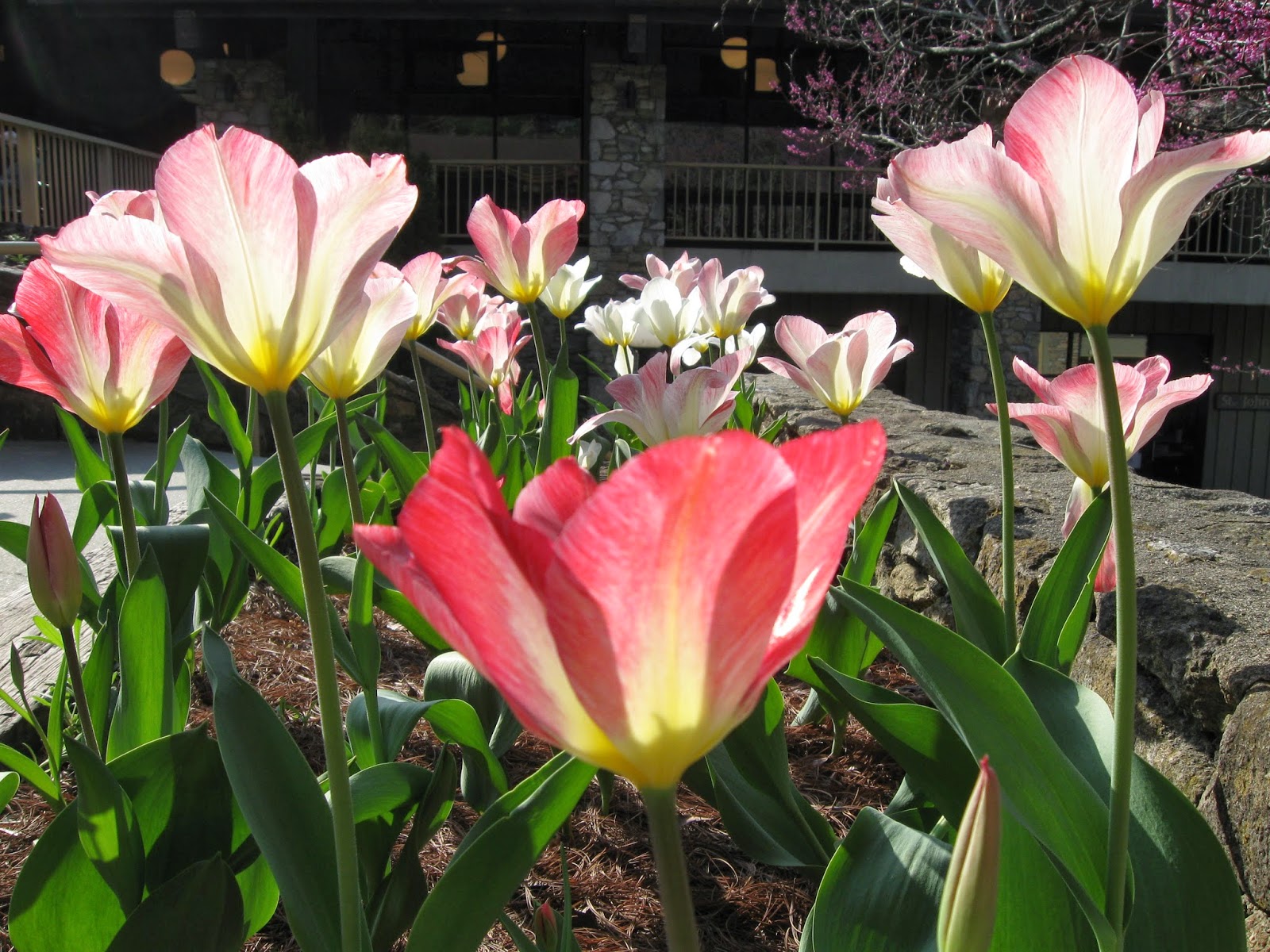
It is very nice to have finished a painting, and, even better, one that I like,  just before leaving for Kanuga.   What a confidence builder!  A few weeks ago,   I took  a great number of source photos of this bouquet of white blossoms, in different blue glass vases and sitting on a variety of blue silk scarves.  This one didn't turn out the way I had planned or even what I expected (so, what else is new?).    But I like it anyway.

I'm all prepared for my "semi-independent study" with Robbie Laird at Kanuga (that's what I'm calling it, I'll report on what it actually is upon my return!).    Having chosen maybe a dozen source photos that I liked a lot, I spent the early part of March doing newsprint drawings from them.  That exercise helped me narrow down which ones held my interest.   I ended up with six favorite drawings.  I traced those drawings onto half-sheets of Arches 140, and THEN soaked and stretched the paper onto both sides of three pieces of Gatorboard.   This should give me lots to work on when I get there. 

I've never prepared so many "starts" at once before.  It has been fun and productive both.  I found my drawing skills coming back a bit as I worked.  I'm quite excited about what will come next, and pleased that I will have four days to work on all of these.    I am already wondering if it will turn into a new way of working for me.

Do most of  you have multiple paintings going at once? I'm usually sorry when I don't, because I am more likely to move too quickly and make poor decisions.  Setting things aside for a bit is never a bad idea.

Sunday, March 23, 2014

Get back to work!


This will just be a short post. You will see why:  Here I am, spending a nice Sunday afternoon, browsing the blogs of my new blog friends  (do you recognize this blog?).  But, I am being observed. See that little poster up there at the right? I circled it to make it more obvious. It was recently provided by an art friend.

Wait.

I'll make it easier for you to see.

And then I'll go.  Maybe you should too?


Friday, March 14, 2014

Mentor or Muse at Kanuga 2014


Kanuga 2011 - it was WARM that year!!!!
The Inn and Lake at Kanuga
I would dearly love to know how many of you are two weeks away from Kanuga, as I am.

Probably I need to insert a brief explanation of what I mean by Kanuga for those unfamiliar with it.  Kanuga Watermedia Workshops is art camp for adults!!!! ( Yay!)  Okay, a better description: a spiritual retreat facility in rural western North Carolina rents out its grounds for a week.  Ten or twelve well known watermedia instructors and maybe 200 artists show up on a Sunday for registration, and then for the next four days everything is about art and camaraderie.  Rooms in either a rustic inn or cabins in the woods, meals together at tables for eight in a big dining hall. Art class all day long, presentations and events in the evening.  And, after three years, even familiar faces.

I've signed up for Robbie Laird's (new) workshop that she's entitled, Mentor or Muse. I'm translating the detailed description to "SEMI-independent study" - at least, I think that's what I'll be getting.  I was initially very excited about this option, but of course as the day approaches, I'm semi-terrified (this is usual for me before a workshop).

The materials list is easy: there isn't one from Robbie, I just need to bring what I want to use.   I started a list for that weeks ago, so I'm feeling fine about that.  But, this time around I really need to know what I want to work on before I get there. So the preparation matters more than usual.

So far I've printed out a dozen or so possible source photos, and actually begun doing composition  drawings from each of them - this I hope will allow me to (1) quickly eliminate ones that are poor choices, and (2) take the 'finalists' and transfer the drawings to stretched w/c paper.  I know I'll need three or four to be working on, like I have at home on my most creative days: one to be thinking about, one to be drying, and one to actually be painting.  I'd like to take even more than that, just in case.  I'm resisting using any of these Kanuga "starts" ahead of time:  I want to keep my brush wet (to paraphrase Marilynn Derwenskus) between now and then, but also want to be excited and happy about what I'll have to work on when I get there. 

So: who should I be looking for when I get there? You, I hope.

Monday, March 10, 2014

Need advice on BLUE

My sweet big sister sent get well flowers (re broken ribs) last week, and they arrived in a cobalt blue vase, my favorite. Today, with a rare day of full sunshine, and a cessation of pain, I took the flowers that were still happy and started taking source photos in the sun room.  Loving the blue, I went hunting for background fabrics (I'm not a collector of such things like I know many of you are).  I found two shawls,  deep blue wool and  turquoise silk, and threw  them all together in the intense sunshine.

(Special note here: the flowers, the vase, AND the two shawls, I realized, were all gifts over the years  from this wonderful big sister! Am I a lucky 'baby' sister?)

So now I have 30+ source photos which, because they all have my favorite colors (and sunshine), are breathtaking to me.  I'd like to tackle at least ONE of them soon. But I've not painted blue very often or very successfully. So, I'm asking:

Looking at this source photo, typical of the ones I will choose from, do you have suggestions of the blues I should be using, and how to use them, to give them the life they deserve? (BTW - In stock I currently have  ultramarine, cobalt, cerulean, indigo,  and pthalo blues).

Friday, March 7, 2014

I don't love it but I like it

I'll go on record.  I don't regret at all that I obliterated the "real" desert sky color here.  I like it much better having taken the image somewhere else. I DO wish that I'd thought of it sooner, so that I could have done a more delicate red wash of a sunset sky - but because I was going over a cerulean and ultramarine wash, I had to get past that. So, it's pretty heavy looking. Surreal. Maybe that's why I like it.  It's certainly unexpected. I find myself thinking already of variations this may inspire -  just not now, too many irons in the fire this month.

Thursday, March 6, 2014

MWCS Reminder - projection of entries

If you are a Michigan artist reading this, please be reminded that this Saturday, March 8th, is the always fascinating Michigan Water Color Society event, the projection of entries for the upcoming annual exhibition.    This year the projection will be held at the Baldwin Public Library in Birmingham.   Click HERE for the MWCS website and calendar.  The projection starts at 1:30pm.


I always try hard to attend this event, because I love to see everything, not just what the juror ends up keeping for the show. As many as 300 paintings are shown for several seconds each, of which only 50 - 80 paintings will later be selected by the juror (depending on the size of the venue).  Of the 200-some that are NOT selected, there are still many many wonderful and interesting paintings, and this is the only chance, sometimes, to see them.   Michigan artists are a varied group, and there will be a wide range of styles, from abstract to still life to portraiture.

And  (if you entered) you get to see your own work projected on a large screen, an experience in itself : in my recent post I was musing about how photographs of my artwork seem to look BETTER when concentrated down to a couple of inches.  When the same artwork is expanded, all bets are off - I am often surprised at which paintings look better, which look much worse that way.  Okay, some are even fairly represented too.

If you've not attended one of these sessions, be reassured that commentary - even whispered - is discouraged quite seriously.  Although honestly, I've often heard murmurs when the subject matter turns out to be an especially cute animal.

I hope to see you there!

Tuesday, March 4, 2014

Disconcerting Discrepancies

Today's question is, why do my paintings look better in online  photos than in person?  This one is about to undergo a serious makeover, because the blue sky was a serious mistake.  It just looks .. .  expected.  I had left it for last so as to decide WHICH blue it needed to be, but now that it's done, I am reminded that, as usual, I am being way way way too literal.  A red or orange sky would have been more interesting or exciting.  So, I took this picture, and two more with colored papers laid over the blue - was going to post them all.  But, now, looking at this image online, I like it fine, and am not even going to show you the possible revisions, because you'd probably try to stop the makeover.

 But, still, you should know, the next time I post this, it WILL look very different.  First I am likely to try a fairly strong rust-colored wash over that wimpy blue.  It probably won't work with the blue showing through.  So then, I plan to mix up gouache, to peach or red or something, and go over the whole sky with it.  Adventure!!!