.JPG)
Please forgive the photography below, I can't seem to get my color right today (snow, then blizzard, then bright sun, then artificial light. Michigan!).
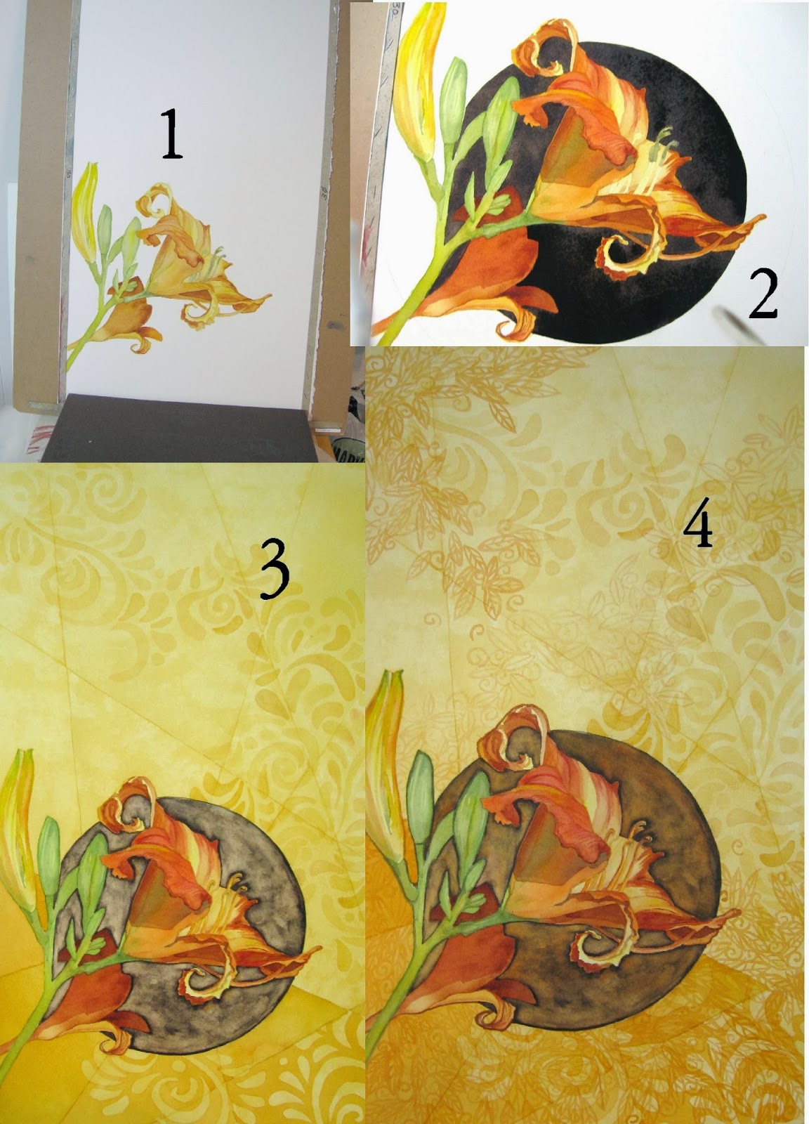 1. I started wanting just these few blooms and buds on the paper with plenty of space for later embellishment. If you've looked at my "gallery" page you know that's what I do often.
2. The blooms weren't popping enough for me with no background: I wanted a reason for the cast shadow to be that strong, so I added the dark circle behind.
3. I needed SUMMERTIME colors (don't we all right about now?) so I added irregular "tiles" of yellow washes. At this point I already knew the dark circle was overwhelming the page, so I scrubbed it down to a mid-tone. I liked the 'outlines' it gave me. Then I turned on my light-table and got started with one of my patterns, in a large scale.
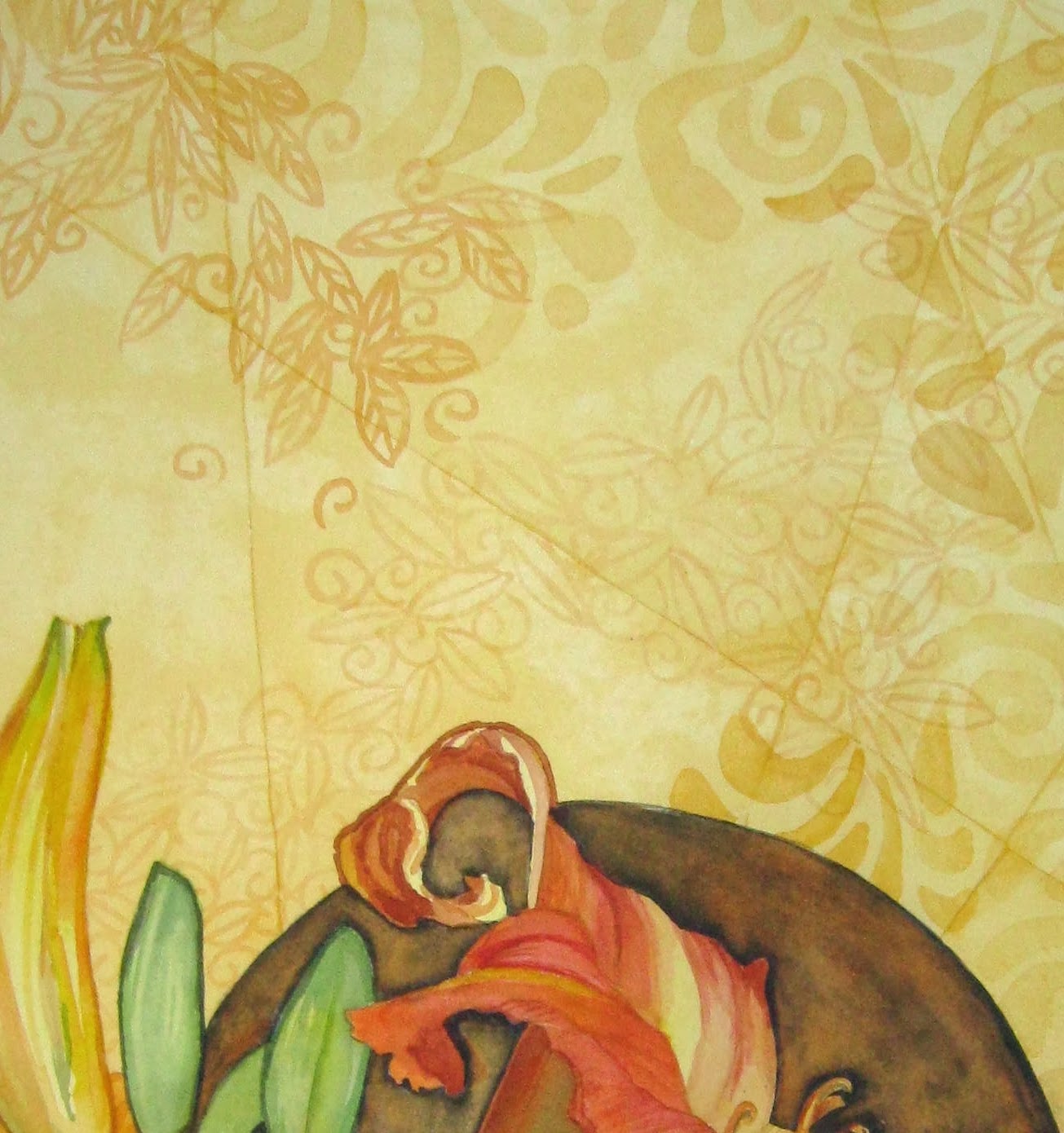
4. I added an orange glaze to the scrubbed circle to give it warmth and depth, then added more layers of patterns, but switching to a more detailed small scale pattern. The detail below left shows that more clearly. I also darkened the values below the dark circle to "hold it up" visually.
All in all, I feel like I made MOST (all) of my design decisions too quickly. I may end up liking this because of the layered patterns. Or I may end up re-darkening the circle behind the daylily and then cropping the heck out of the whole thing.
I think I need to go start something else!
Dear Katherine - here I go - - - hold on - - -
ReplyDeleteIf I lived close to you I would have to come over and slap you silly! I loved the black - it was such a bold statement and really made the lily "pop". And I cannot express how much I love, love, LOVE all that detailed pattern work - you make my piddly little attempts look futile!
So go do something else - then come back to this with "fresh eyes". Let's see if you decide to re-darken that circle!
You have such an elegant syle to your paintings.
(I wouldn't really slap you, just a figurative smack upside tha haid with a 2x4 though!!!!)
This comment has been removed by the author.
DeletePHEW!! Thanks, I need that. . . .Deb, will you come slap me silly more often? Oh, and maybe SOONER next time? I have tucked the painting completely out of sight now (the 'corner of my eye' view made a few of those bad decisions). And have started anew on a completely different painting.
DeleteYou know, I love being in that painting zone, but I guess they're not all equal, are they: this one was a wee bit . .. . frantic?
Also. Deb: I have never seen one of your paintings with futile- (or piddly-) looking pattern work. Name ONE! I dare you
I agree with Deb, I loved the contrast and of the dark black and the orange,but I also enjoy the completed painting #4 . I was wondering how you get the embellishment effect? It almost looks like a stencil it is so precise?
ReplyDeleteFor the 'solid areas', I have patterns I've drawn on large sheets of sketch paper. I pick one that seems appropriate, and lay it on my light table with the paper (140 lb) over it. Then I just use a thin wash, usually of the same color, and follow either the positive or the negative of the design. I often turn the light off and back on, so as to see what's happening, and usually find that I need more water and less paint - or some dabbing with kleenex. There's also a line-design layer in this one that I did with a fine-tipped round - that's freehand.
DeleteI agree with Deb. I thought the black circle was dynamite, although I may have preferred a dark mix with some variation rather than a solid black. You can always tell when color has been removed, as in the current circle. However, if you weren't happy with it, it was worth a try.
ReplyDeleteI would also so want to crop the painting, maybe square. Just focus on that gorgeous orange flower!
Spontenaeity (sp?) is great, but I think we would all do well to spend some time pre-planning instead of making all the decisions on the fly. Just working out a quick value study beforehand can really help with composition as well as value. This is what I am really working hard at doing - pre-planning!
I will be posting my next painting soon, so you can critique me!
The dark circle isn't black, I avoid that. It's a mix this time of mostly quin.burnt orange, darkened with - wait, which blue did I use this time? Maybe it was Pthalo. Not sure. Anyway, it was a very warm dark so as not to fight with the oranges of the blossom.
DeleteI think you are right that to make this successful, I'll need to re-darken the circle (wonder how THAT will look after the scrubbing!), and probably crop too. Not what I had planned for, I wanted all that open space and pattern. Again, you are right that I obviously DIDN'T do the planning I should've, and this is the price I will pay. That takes SOOOOO much discipline for me, though.
I'm looking forward to seeing what you post: the series? or something else? Guess I just have to wait....
Oh, dear! I, too, agree with Deb that the "black" circle really popped the floer out. I love the design. I would only crop a bit off the top so it's not squared and darken the circle and call it done. I love the patterning and the look of the flower reaching up and to the upper right side :)
ReplyDelete