What a great lesson today, great fun for the likes of me! We started with a choice of one of two
vacation “snapshots”, provided by Judy. Our assignment was to find what we
liked about the source, and what we wanted it to say, then to modify the source
to make a well designed painting. We
used black and white copies, scissors, tape, tracing paper, plain paper, gray
markers in various values, white correction pens and chalk. We rearranged conflicting shapes, removed or
modified confusing elements, changed values from light to dark or vice
versa. And of course, ended up with a
different solution for each of us.
 |
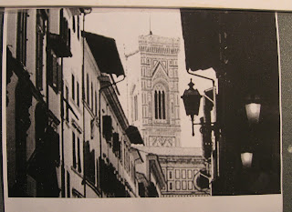
| This is the original photograph. |
 |
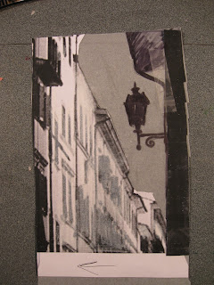
This was my take.
I completely omitted the church tower in the center, changed the building
on the left to be a very light value, and the sky to a middle value. I removed the confusing awnings from the building. I also messed with the lantern to make it even more important in the composition. The instructor thought it was a very
strong solution. Won’t be painting it:
next we are starting over with our own source photos.
This technique makes me feel like I’ll be going back to my drawers full of
mediocre vacation photos to see which of them might make a smashing painting! It takes a bit of time, but feels like a reasonable way to use source photos, yet free oneself from literal interpretation.
| | | | | | | | | | | | | | | | | | | | | | | | | | | | | | | | | | | | | | | | | | | | | | | | | | | | | | | | | | | | | | | | | | | | | | | | | | | | | | | | | | | | | | | |
|
|
|
|
|


Hi Katherine! I have been following your progress at your art workshop. I think that is a great idea! It is a great teaching tool plus you will remember more of what you did!
ReplyDelete