Friday, February 28, 2014

Coloring in - WIP

This WIP landscape was inspired by work of  Carolyn Lord. I saw her work in the most recent Watercolor Artist magazine, and thought I'd try a landscape "her way" ( a friendly forgery!) to see if the technique resonated with me and could get me past my fear of landscape failure.  It's her use of discrete shapes ('shape painter'!) that appealed.

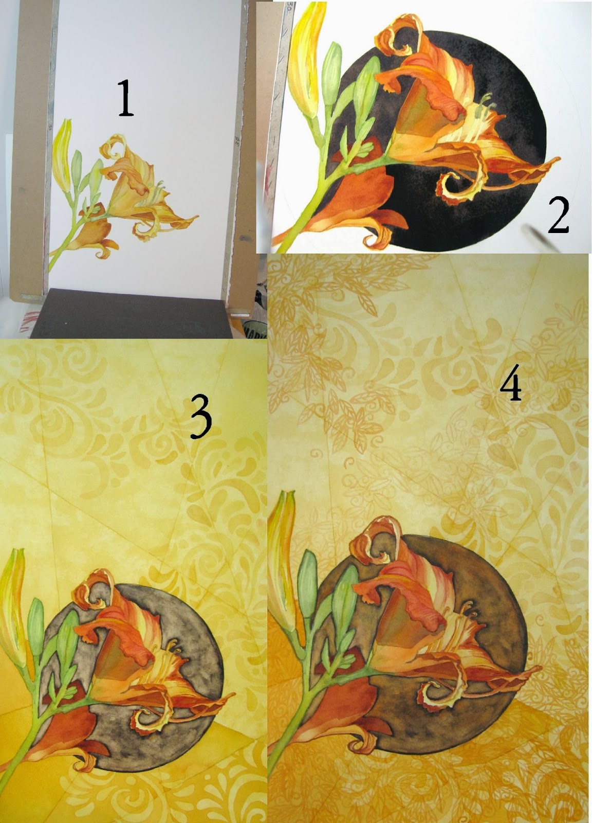
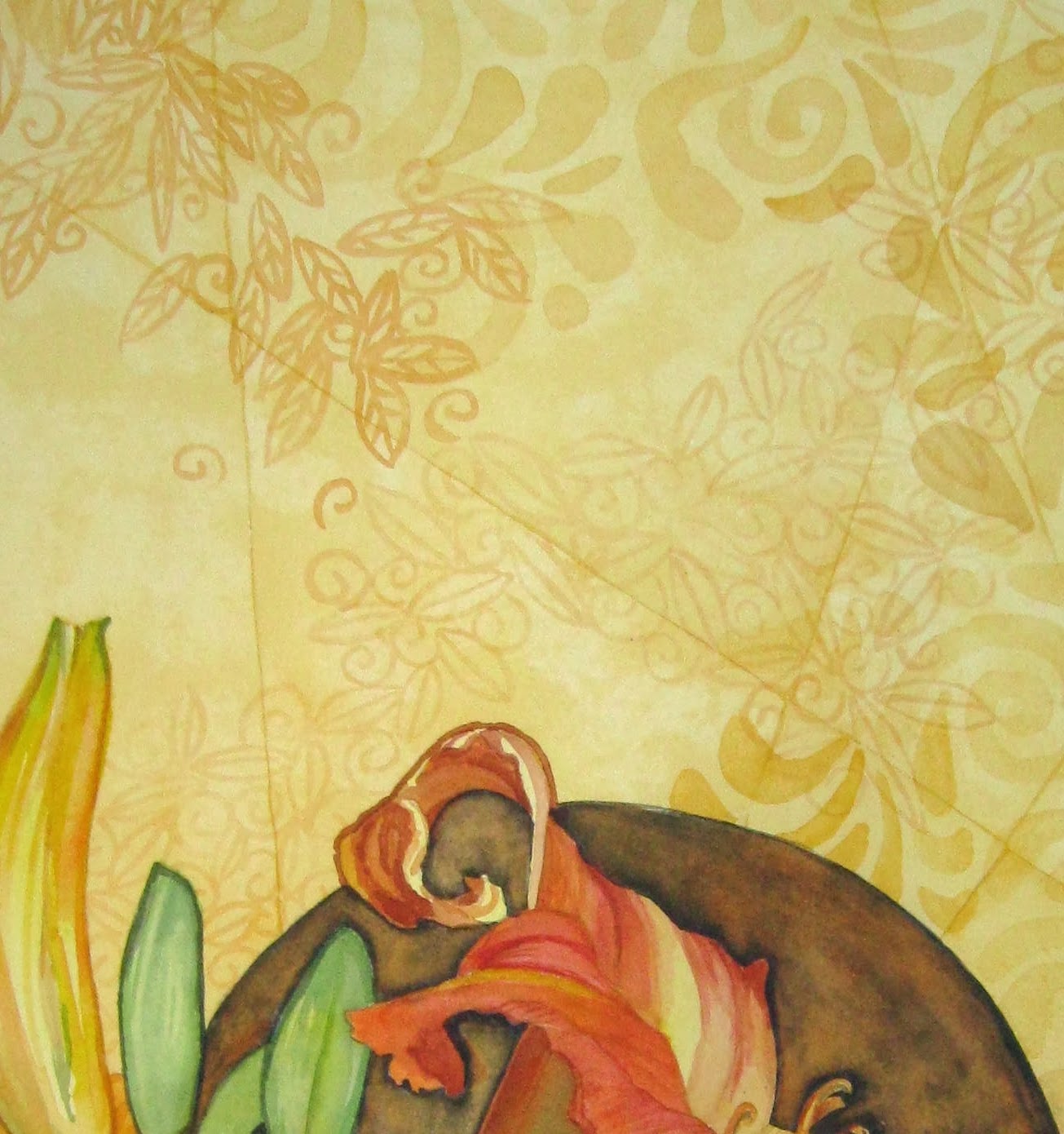
I found one of my favorite vacation photographs to use as a source, and did several drawings to get the composition right, then used my light table to create a shape-focused version, tracing the key and interesting shapes I'd made.  Even though the paper is 300 lb rough (bought for a workshop and never used) I was able to use the light table to transfer the design onto it.

And I'm very glad I did, because just about at that point I managed to trip over my own feet, break two ribs, and pretty much ruin the rest of the week (month? months?) for creative energy.   I've found out that sitting and lying down are the MOST painful, so when I've had the energy,  I've been standing at the kitchen counter to internet surf, or standing at my studio's high counter to just start filling in the colors in this.  Like my own personal coloring book, and I'm just about that serious about it.   How restful and healing this has been. And, since it's well outside my normal work, there's no pressure, I have less invested in the results.   I thought I'd share it as a WIP, and so you'd know to expect to see much less work of mine here than usual, for a while.

But, blog friends,  be warned: with all this time on my hands, I'm watching YOU!  Keep busy and keep posting paintings to entertain me, please!

Tuesday, February 25, 2014

Summer color needed

I think this is just about done, although I may give into temptation and add an ever-so-minimal dark lined pattern in the background.  The painting is nothing great, but it was a joy to work in these pinks, reds, and oranges. They made me think about Summer, and hot weather -  not just spring. For much of it I was able to relax and be much looser than usual, letting the colors puddle together and then separate. A lot of granulation, which I'm finding I like a lot.  Has anyone out there used that Granulation Medium?  I might need to try that.

Tuesday, February 18, 2014

Risking Failure

I think I'm pretty happy with the results.  It's not my best or favorite painting, by any means.  But I'm glad I took the chance of ruining it in order to make it right - after all, it's just a piece of paper. In trying this method to pick up color so I can insert another, I learned something:  A- it works. B- next time, expect to need  places to put balancing color, and save them somehow!

I need to embrace my failures more - and, more important, risk them more - in order to learn and grow. This was one of those times.   Sometimes, though, the end result is so gruesome, it will never be shared - those are the ones that end up covered with gesso and used for occasional cat paintings.  Maybe we should start sharing those?  But, probably,  none of you have anything failures like that . . . .

Monday, February 17, 2014

A gamble, but it worked - a step-by-step.

Step one: I arranged orange pieces of w/c paper where I wanted the 'sparkles' to end up.
I laid 'frog tape' over all the stencils and on gaps in between: I can be pretty messy.  In the past I've had problems finding my pencilled design when I was ready to cut through the tape. This time, instead of tracing with a pencil around each little shape, I decided to try just leaving them there under the tape to be cut out in the next step.

I used a sharp blade to cut through the tape, keeping the blade tightly against the w/c paper stencil which I had left beneath. This seemed to help me quite a lot in keeping the cuts very straight and the corners sharp.  I don't know if it would have helped as much for curves, I'll have to do an experiment along those lines.

I used an embosser along the edge of each cut - I could see the tape darken as the seal improved.

Ready to start the scrub. Looks pretty messy, huh?

I used small cubes of magic eraser to lightly scrub (wipe) off the dark paint.  I tried not to use too much water, and I blotted frequently with a tissue held ready in my other hand. I changed to  new pieces of the eraser frequently.

I think the little white places came pretty clean and with nice sharp edges - well,  most of them (one of them got too wet and the water bled under the tape).   I then painted them with the bright orange I wanted to carry around the page.  I'll post the finished painting tomorrow.  I'm glad I took the chance on this one, it really did need that additional sparkle. 


Friday, February 14, 2014

Will I ruin it in the 3rd act?

I agreed with Kathy's input, so I've darkened the "throat" of the lily quite a bit, and bravely (foolishly?) emphasized the water droplets that I'm feeling so vain about.

But the orange, now, that's a different story. Adding a glaze to the gray areas just warmed and dulled those grays (I quickly tissued it back off!). The orange sparkles you see now are cut from another piece of paper, to see how they would look. If I do decide to try something like this, I'll  have to do some REALLY careful masking and use the magic eraser to remove the dark cool colors first. I tried, on a dark scrap, to use a double layer of watercolor pencil, orange over white. But I can't get it to photograph at all, and I'm pretty sure it would become a distraction (worse that just leaving off the orange).  Thoughts?

Thursday, February 13, 2014

I guess I'm a florist at heart

I'm thinking this is done. Probably.  It was a joy to be painting flowers again, and I enjoyed making up a leafy but not accurate background.  First time I ever painted a dewdrop, so that was fun.  One of my favorite new colors is the gray I get from a wash of  indigo, then a wash of any of a few different oranges. That's the lightest color you can see in the background.  I've already started another daylily.

Just got my order from Cheap Joe's with a restock of Arches, as well as two more gatorboards for stretching my (half-sheet) paper.  This way I can get as many as 8 sheets ready to go at a time.  Part of preparation for Kanuga, now only six weeks away!

I hope all you southerners have survived the most recent snowstorm with power and heat intact. I heard that Asheville, the closest city to Kanuga, got 15 inches of snow. I had been hoping to see Spring when I got there. Oh well.

Wednesday, February 12, 2014

BSWP Exhibition in Plymouth, Michigan


This is the first of a number of upcoming events in which I will be participating.  When I take a longer break from painting, I will set up a more complete section to the left and add the others.

And I'll post a new painting, too!


Saturday, February 8, 2014

Thanks for all the help!

I think I took a page of advice from each of you who were nice enough to
offer your help.  All the feedback was much appreciated.  The dark circle, thankfully, was easy to paint back in, in spite of the scrubbing.   The background pattern now balances the dark, much better than when it was against a raw white background.  The only thing left is to decide on the crop  (I tried to upload pictures of it all three ways but, strangely, the tight square crop keeps turning itself 90 degrees when it gets into Blogger. Wish I understood that.  Also, I seem to have trouble arranging my text and pictures the way I'd like. Something else to study up on).

I think I have an available frame in the full size - it currently holds a disappointing painting that also needs some rethinking.  I will pull that one apart, and drop this painting in, then hang it in the dining room for a while to think . . more slowly than previously.
And on to the next adventure.  Thanks again, friends.
 

Wednesday, February 5, 2014

Maybe I should stop to think longer?

Well, I am attempting to show my step-by-step decisions, many of them poor and hurried.  I'm pretty sure most of you with truly successful paintings don't bang around inside a wet paper bag like this. 

Please forgive the photography below, I can't seem to get my color right today (snow, then blizzard, then bright sun, then artificial light. Michigan!).

1. I started wanting just these few blooms and buds on the paper with plenty of space for later embellishment. If you've looked at my "gallery" page you know that's what I do often.

2. The blooms weren't popping enough for me with no background: I wanted a reason for the cast shadow to be that strong, so I added the dark circle behind.

3.  I needed SUMMERTIME colors (don't we all right about now?) so I added irregular "tiles" of yellow washes.  At this point I already knew the dark circle was overwhelming the page, so I scrubbed it down to a mid-tone.  I liked the 'outlines' it gave me.  Then I turned on my light-table and got started with one of my patterns, in a large scale.
4.  I added an orange glaze to the scrubbed circle to give it warmth and depth, then added more layers of patterns, but switching to a more detailed small scale pattern.  The detail   below left shows that more clearly.  I also darkened the   values below the dark circle to "hold it up" visually.

All in all, I feel like I made MOST (all) of my design decisions too quickly. I may end up liking this because of the layered patterns. Or I may end up re-darkening the circle behind the daylily and then cropping the heck out of the whole thing.

I think I need to go start something else!